
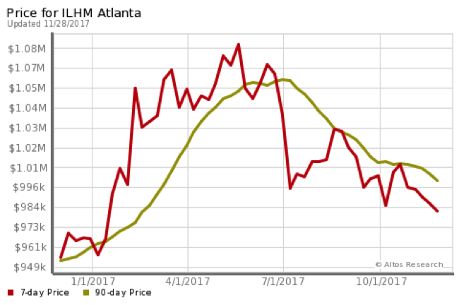
Price for Luxury Home Market
In Metro Atlanta
This is the chart for average luxury home in metro Atlanta.
The red line is the last 7 days and the green line is the last 90 days rolling average.
Interpretation: Atlanta luxury homes have decreased for the first part of 2016 and have been rising since November (8th?).
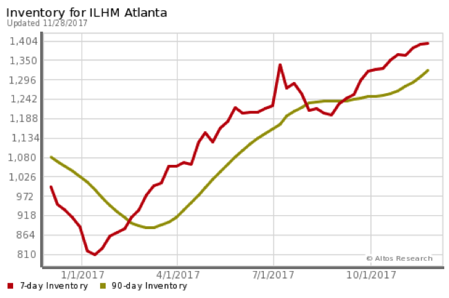
Number of Luxury Homes Available
In Metro Atlanta
This is the chart showing the number of luxury homes available in Atlanta.
The red line is the last 7 days and the green line is the last 90 days rolling average.
Interpretation: As inventory rises (i.e. more choices for the Buyer) one can expect to see prices lower and less time on market. For any price range, less than 6 months inventory favors the Seller. In homes above $1,000,000 in Atlanta, we have inventory supply measured in years.
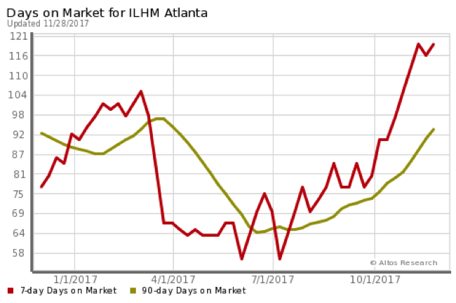
Luxury Homes - Days On Market
In Metro Atlanta
This is the chart showing the average days on market.
The red line is the last 7 days and the green line is the last 90 days rolling average.
Interpretation: An Atlanta home that is priced correctly will take between 52 and 122 days to sell.
Luxury Homes - % of Price Reduced
In Metro Atlanta
This is the chart showing the percentage of listings with the price being reduced (meaning listing was not getting offers.)
The red line is the last 7 days and the green line is the last 90 days rolling average.
Interpretation: Large percentage of Atlanta luxury home Sellers are over-pricing their property.
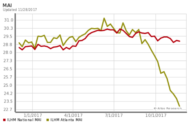
MAI - Market Action Index
For Atlanta
This index shows if the market is favoring Sellers or Buyers. A value above 30 favors Sellers.
The red line is the National MAI and the green line is the Atlanta MAI.
Interpretation: Atlanta luxury market heavily favors the luxury Buyer. Frequently purchasing for far less than cost to build.
• Charts Based on Average Data From The Institute for Luxury Home Marketing •
The Top 10 Priced (with median price above $500,000) Zip Codes in Metro Atlanta
Updated November 28, 2017
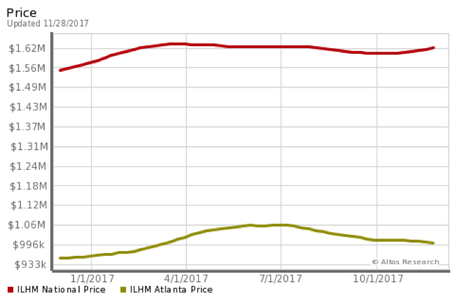
Affordability of a Luxury Home
In Atlanta
This is the chart for median listing price for a luxury home.
The red line is the national median listing price and the green line is metro Atlanta.
Interpretation: Atlanta luxury market heavily favors the luxury Buyer. Frequently purchasing for far less than cost to build.
Above 30
Favors Seller
Below 30 Favors Buyer
US
Atlanta
30005
30022
30068
30075
30097
30269
30305
30326
30327
30338
Top 10 Net Worth Zip Codes In Atlanta
Institute for Luxury Home Marketing Housing Report Charts: Atlanta

More specifically - Below are Charts from Harry Norman, Realtors
Roswell Homes that would attend Roswell High School
All Price Points

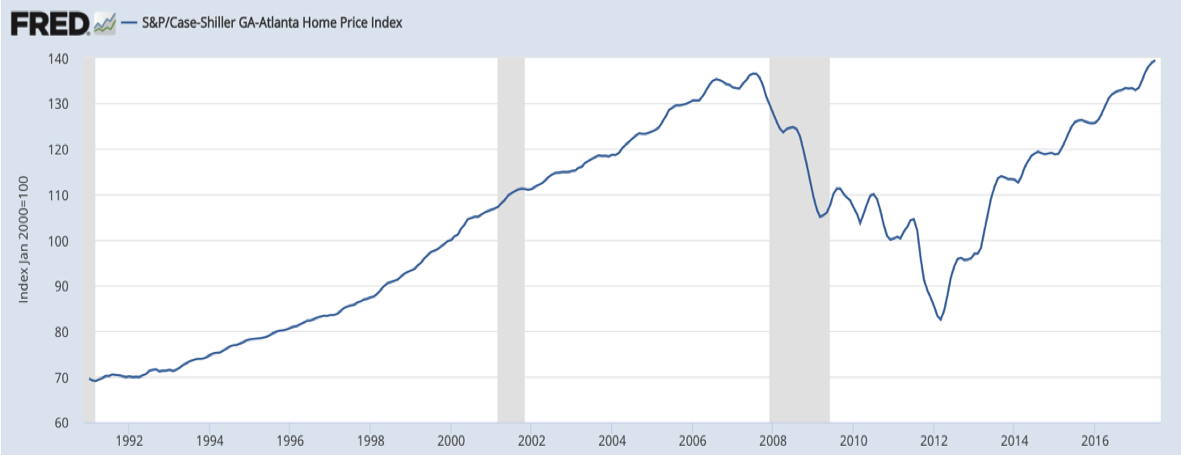

Graph Thru
July 2017
Click Logo To See Source ====>
Keep Scrolling Down to see
Lots of charts
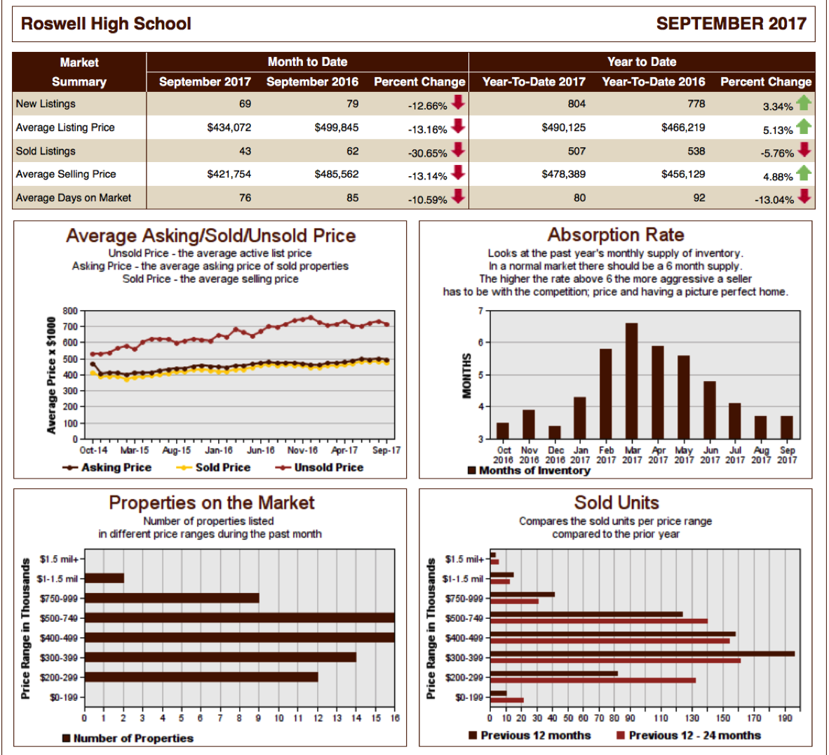
July
2017


